Not All Charts are Created Equal
Powerful, easy to use charts
Enter data on the spreadsheet and let AimiHub do the hard work for you by calculating the control limits,
mark special causes, and annotations.
The spreadsheet allows for multiple worksheets, each rendering a different chart allowing more control and flexibility.

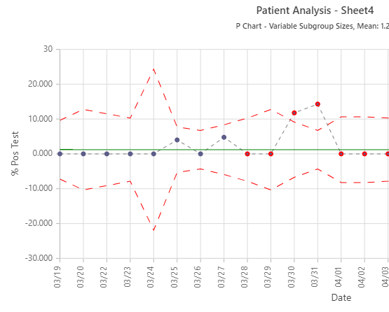
Shewhart Charts
The Shewhart Chart (aka Control Chart) is the means to operationally define the concept of a stable process. They help us to understand and reduce variation in our processes.
AimiHub supports over 15 charts and takes care of the math, plotting the data and making statistical calculations as well as pointing out the special causes so you can focus on analyzing the data.
Calculate The Right Limits.
Every time.
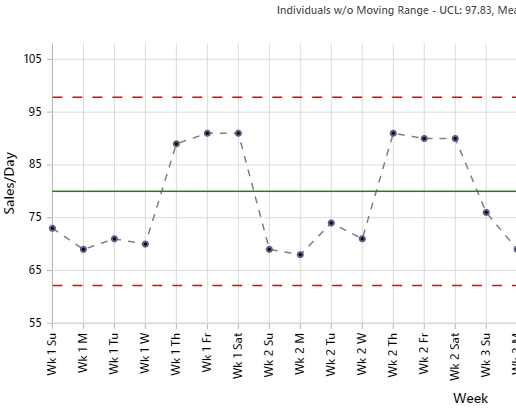
The “moving range” (MR) (the difference between consecutive data values) is the statistic used to determine the common cause variation for an I chart. The rationale for using the moving range to determine the process variation for the I chart is that pairs of consecutive measurements are more likely to be affected by similar causes than are results at other points in time.
Limits should be established on the basis of common cause variation only. Individual moving ranges that are inflated by special causes are screened prior to calculating the limits for the I chart. This minimizes the effect on the limits of special causes on the initial data set.
Alternatively, direct calculation of the standard deviation using all the data causes the limits to be inflated with special causes as well as common cause variation.
Beware that various software programs use this inappropriate approach to calculating limits for I charts. ^
AimiHub's powerful statistics engine uses the approach that helps to ensure that limits are more useful and practical in application so you do not miss any opportunities and make any wrong decisions.
^ The Health Care Data Guide by Lloyd P.Provost and Sandra K.Murray

Intuitive and Familiar Interface
- Powerful spreadsheet interface for data entry. Use Excel formulae in the columns for calculations.
- Copy/paste or import data from Excel, Google Sheets or your favorite spreadsheet application.
- One spreadsheet with multiple charts to group related data.
- Need annotations? No problem: Just add a column called Notes and start typing. ^
- Need to ghost a point? No worries: Add an asterisk (*) to the beginning of your Notes column. ^
- Process Capability Calculations when the process is stable. ^^
- Collaborate with other team members using Huddle.
- Define Phases, extend limits and more by a simple settings panel that can be customized for each worksheet. ^
- Data History to quickly roll back to a previous data version.
^ Not applicable to Pareto Charts, Run Charts, Scatterplots and Histograms. ^^ Only applicable to Xbar S charts.

Covid-19 Analysis
As the world is experiencing a pandemic in 2020 and beyond, you may have noticed that the data is being reported in data tables or maps generally with cumulative numbers.
Cumulative data “smooths” the variation, but only tells us a picture in time where we have been. When the numbers go up and down, people tend to over-react or under-react. Over-reacting during a pandemic can naturally cause hysteria, or fear of making a critical mistake.
Recently, in a ground-breaking article published in US World Report, API partner, Lloyd Provost et al took COVID-19 death statistics and created a new Exponential Shewhart chart. AimiHub has the ability to draw this chart which is used to model the behavior of a contagious disease such as COVID-19.

Scatterplot Graphs
Scatterplot graphs are used to plot data points on a horizontal and a vertical axis to show how much one variable is affected by another. Each row in the data table is represented by a marker whose position depends on its values in the columns set on the X and Y axes.
Scatterplot graphs are as easy as getting the data in a spreadsheet and let AimiHub do the rest.

Help is only a click away
If you get stuck at any point, do not worry, we have your back.
Whether it is how to enter data, what the special causes are, how to choose the correct chart or any other topic, AimiHub provides extensive help.
We do not have sales people or use external support. When you reach out to us, you will be in touch with people who are involved in the development of AimiHub.
With AimiHub, you are always getting the best advice and information, and in good hands.
AimiHub Charts
- C Charts
- Exponential Control Charts
- G Charts
- Histograms
- Individuals Charts (I or I Mr)
- P and P' Charts
- Pareto Charts
- Run Charts
- Scatterplot Graphs
- T Charts
- U and U' Charts
- Xbar S Charts
Ready to get started?
Email us to book a demo or to discuss how AimiHub may assist you with your projects.
Email Us